Pipette
Brand Awareness Campaign
A re-introduction to Pipette as a clean baby brand, focused as much on mom as baby. Purpose was to create a strong brand identity, emphasizing the brand colors as a key point of recognition. Connect the customer who lives aspirational yet approachable lifestyle, with visuals tying into sophisticated clean beauty brands. Rolled out new branding and strategy focusing on mom remaining true to herself.
UPDATED BRAND GUIDELINES
Gave Pipette brand a new cleaner aesthetic, updated both high level concepts and granular concepts
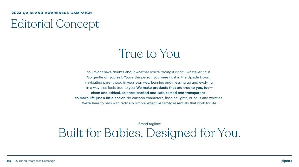
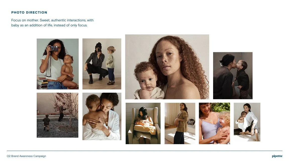
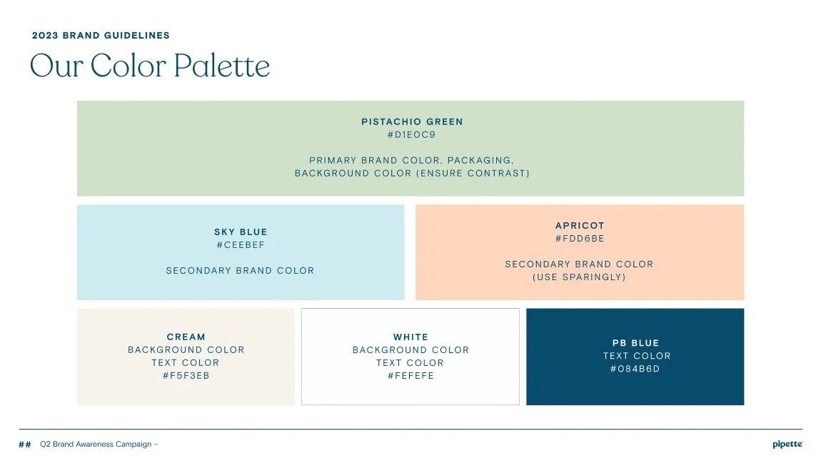
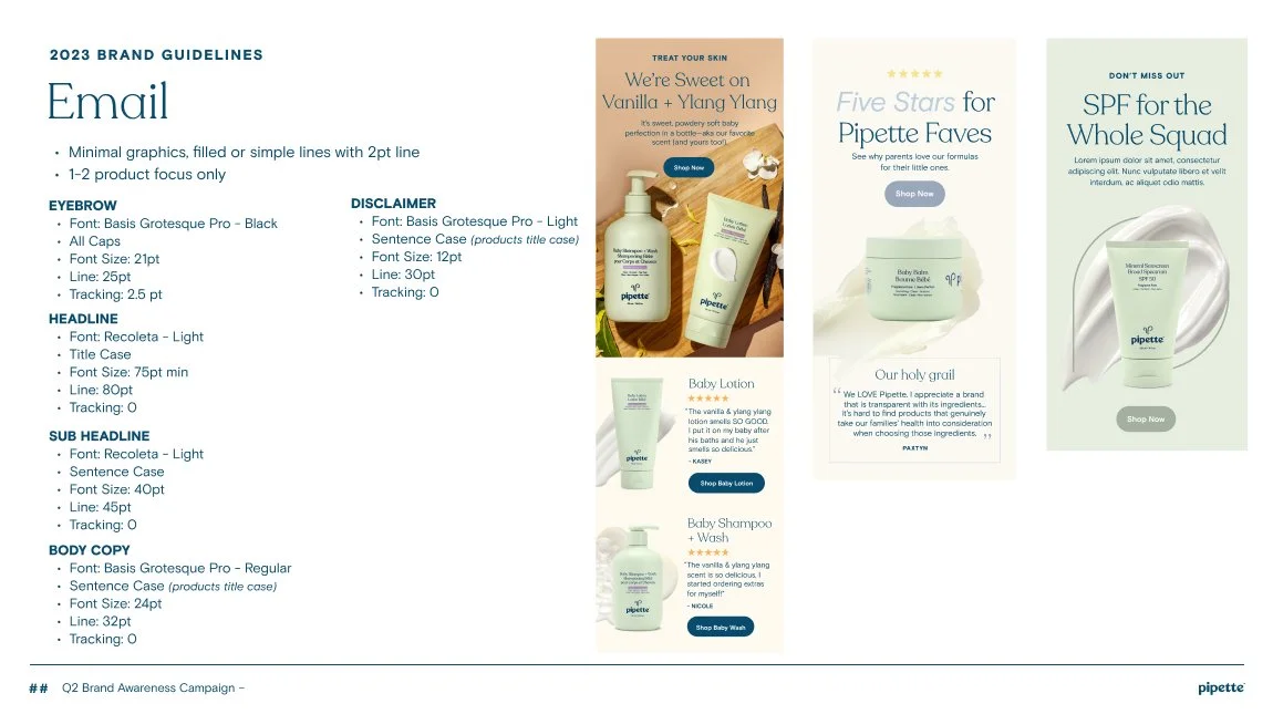
PHOTOGRAPHY
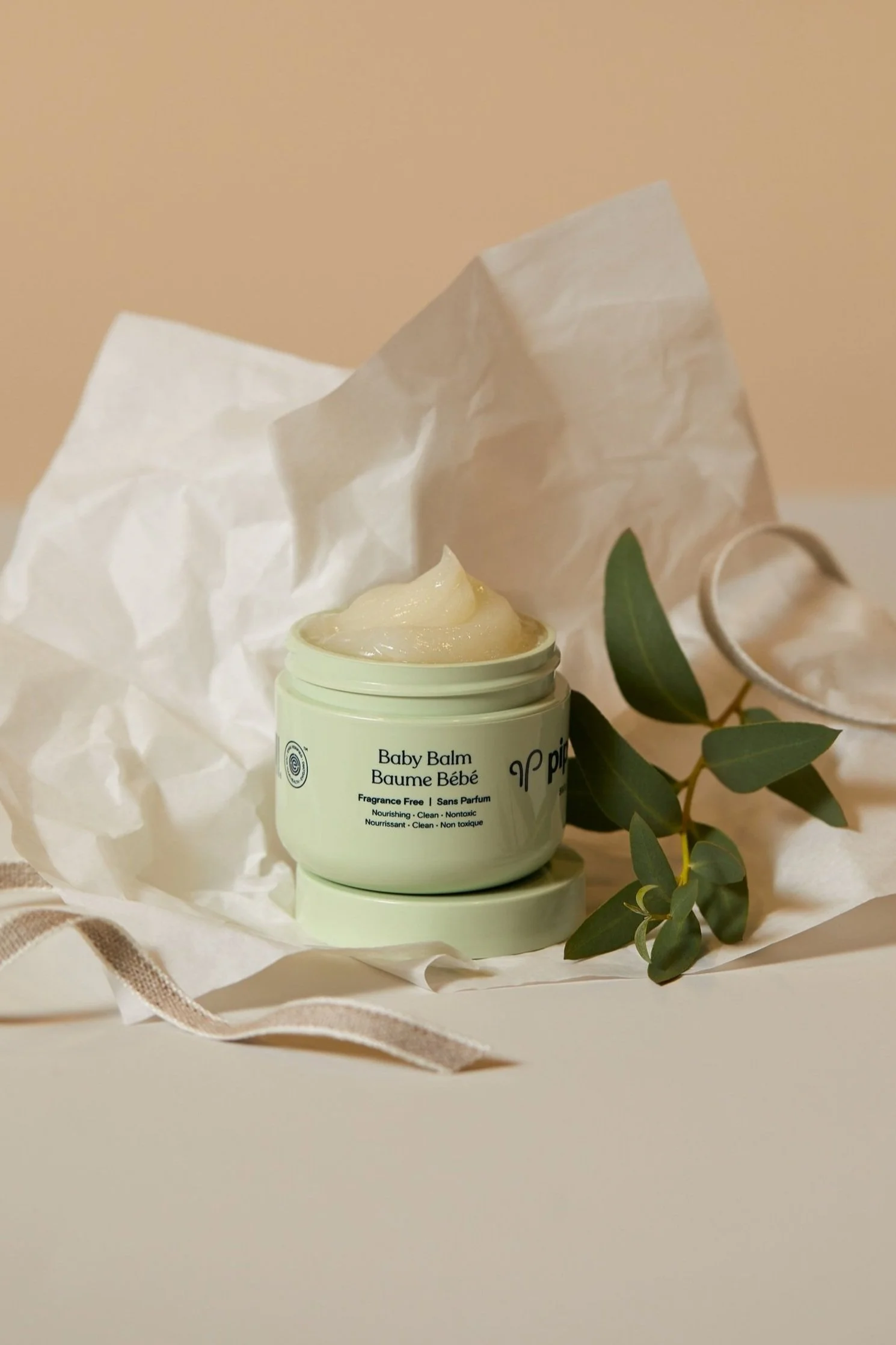
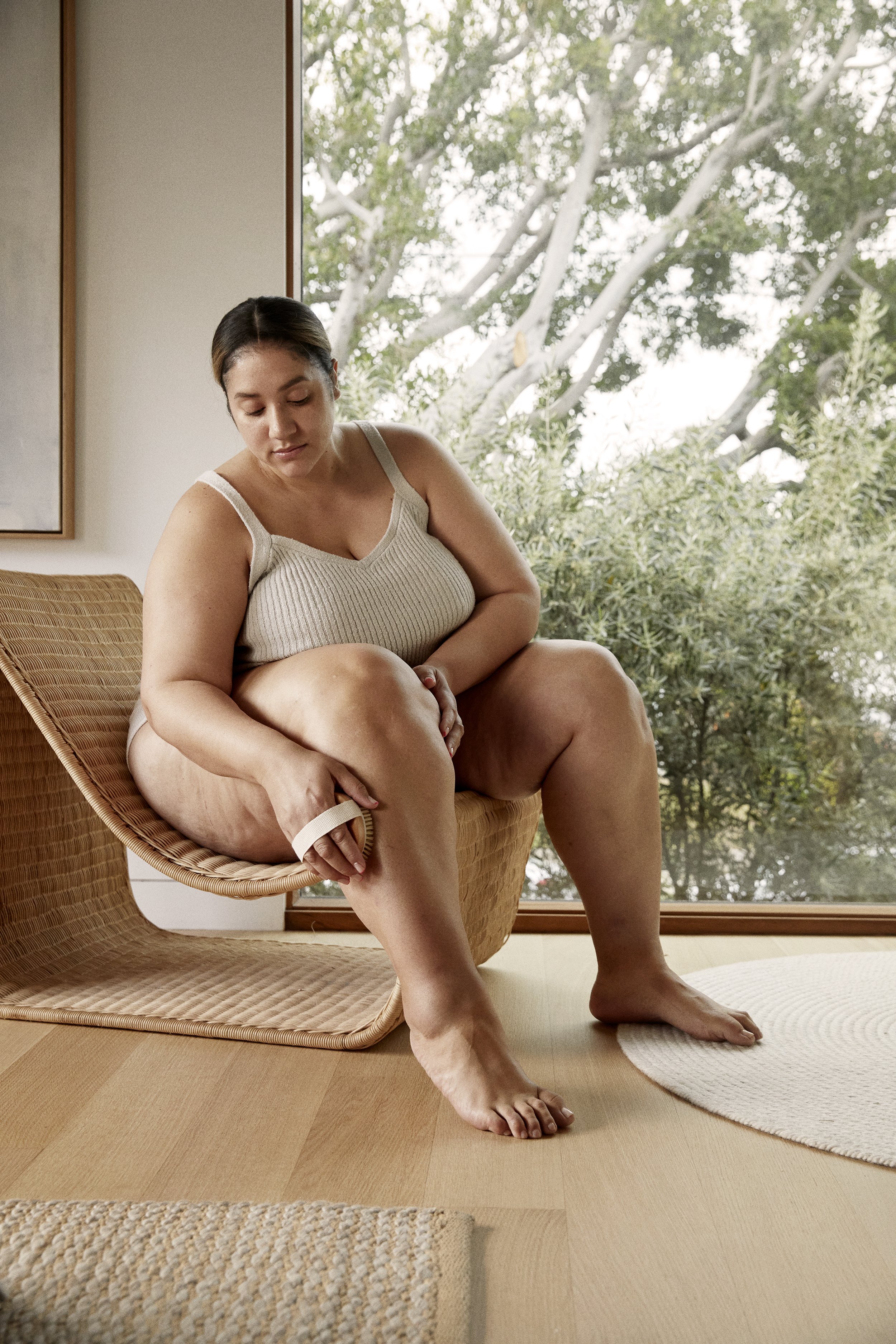
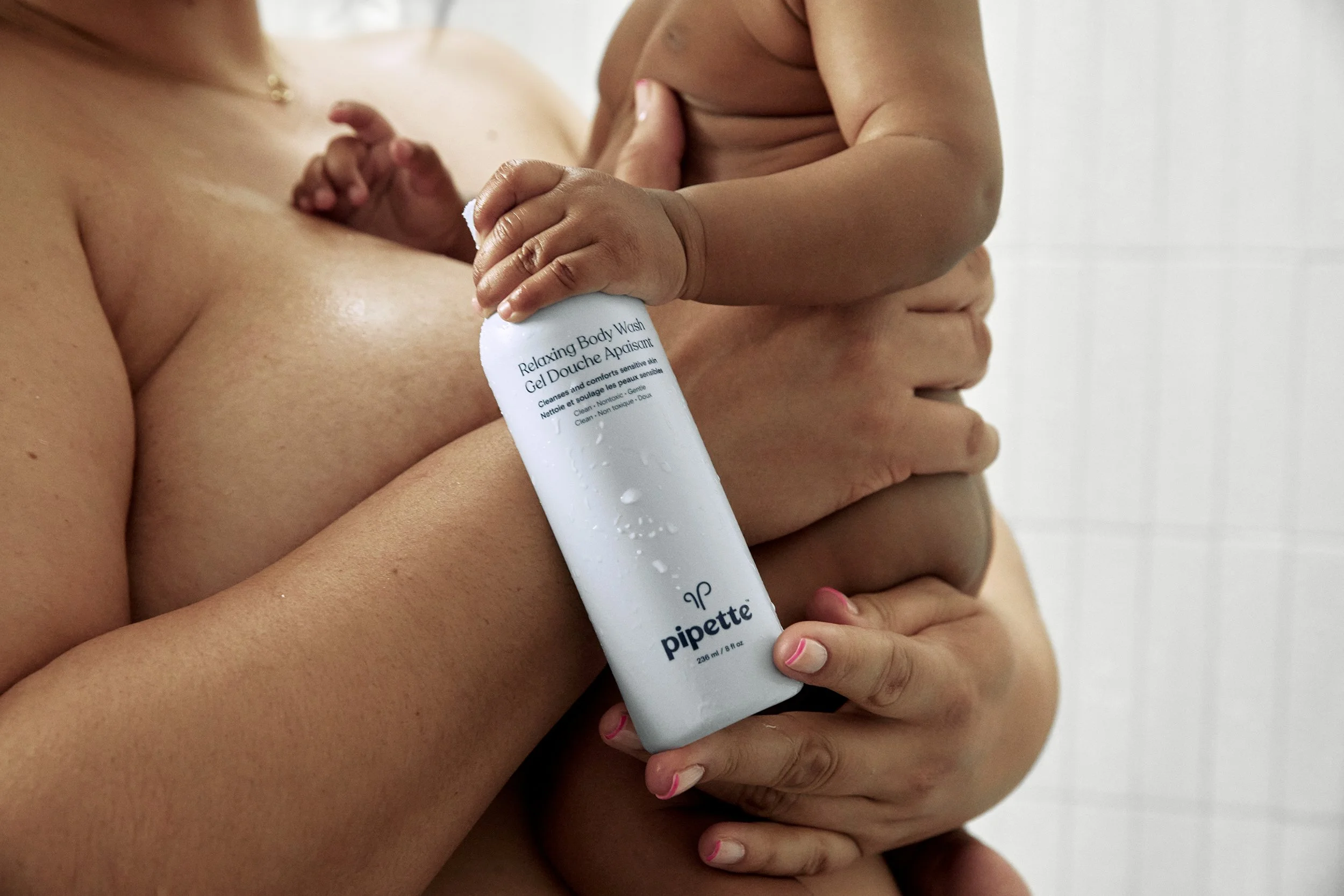
Modern motherhood. Moms with style and taste, clean girl aesthetic. Diversity and inclusivity. Accents of brand color in prop styling.
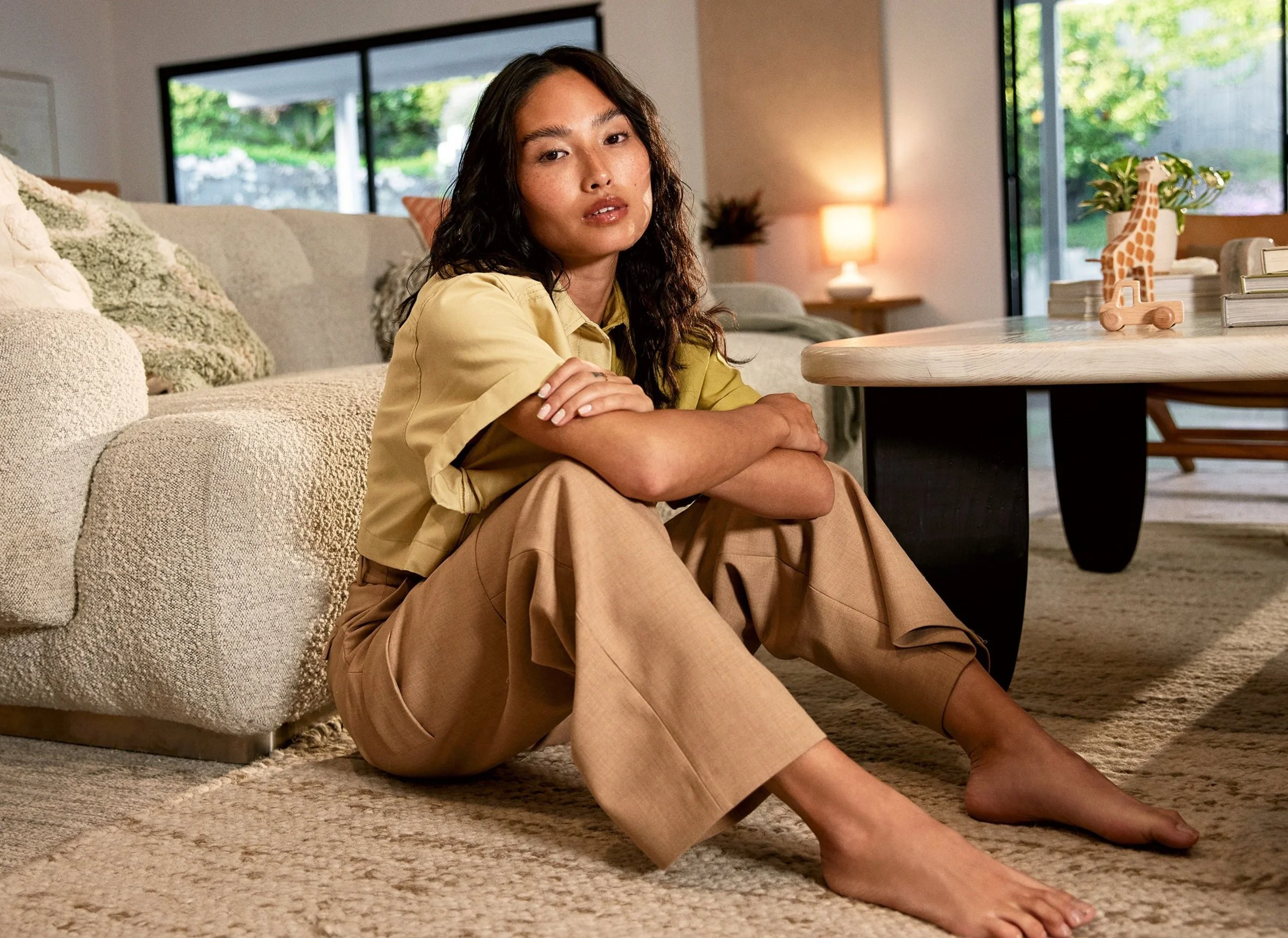
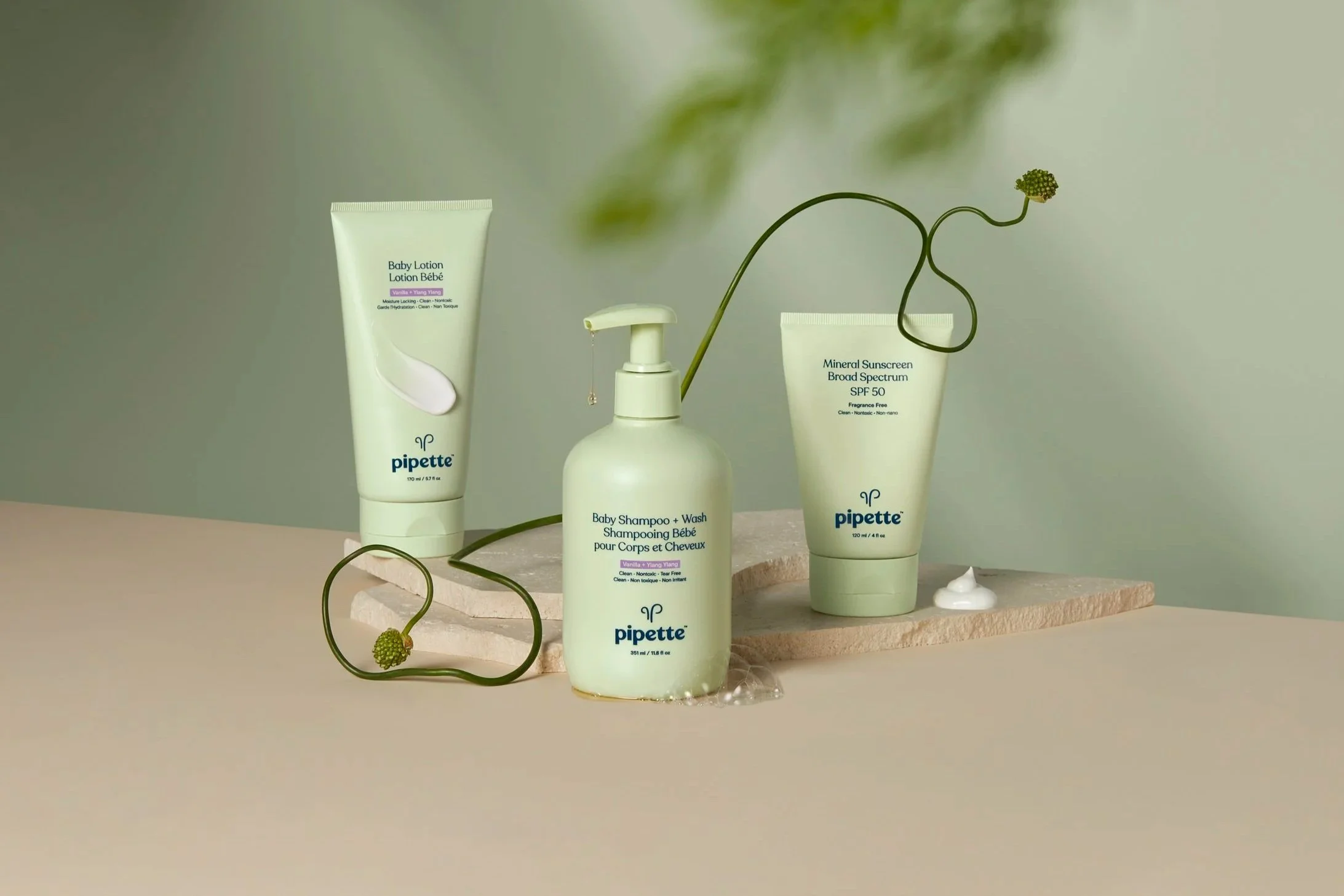
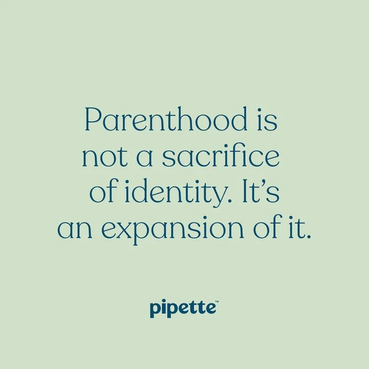
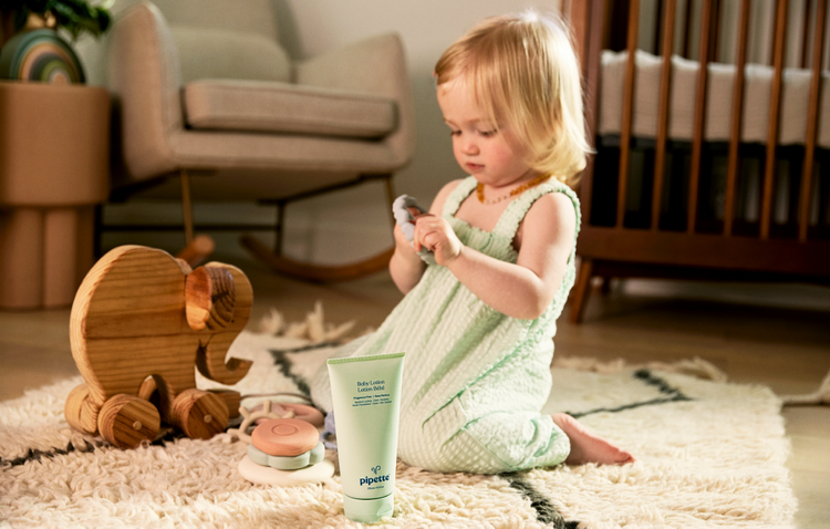
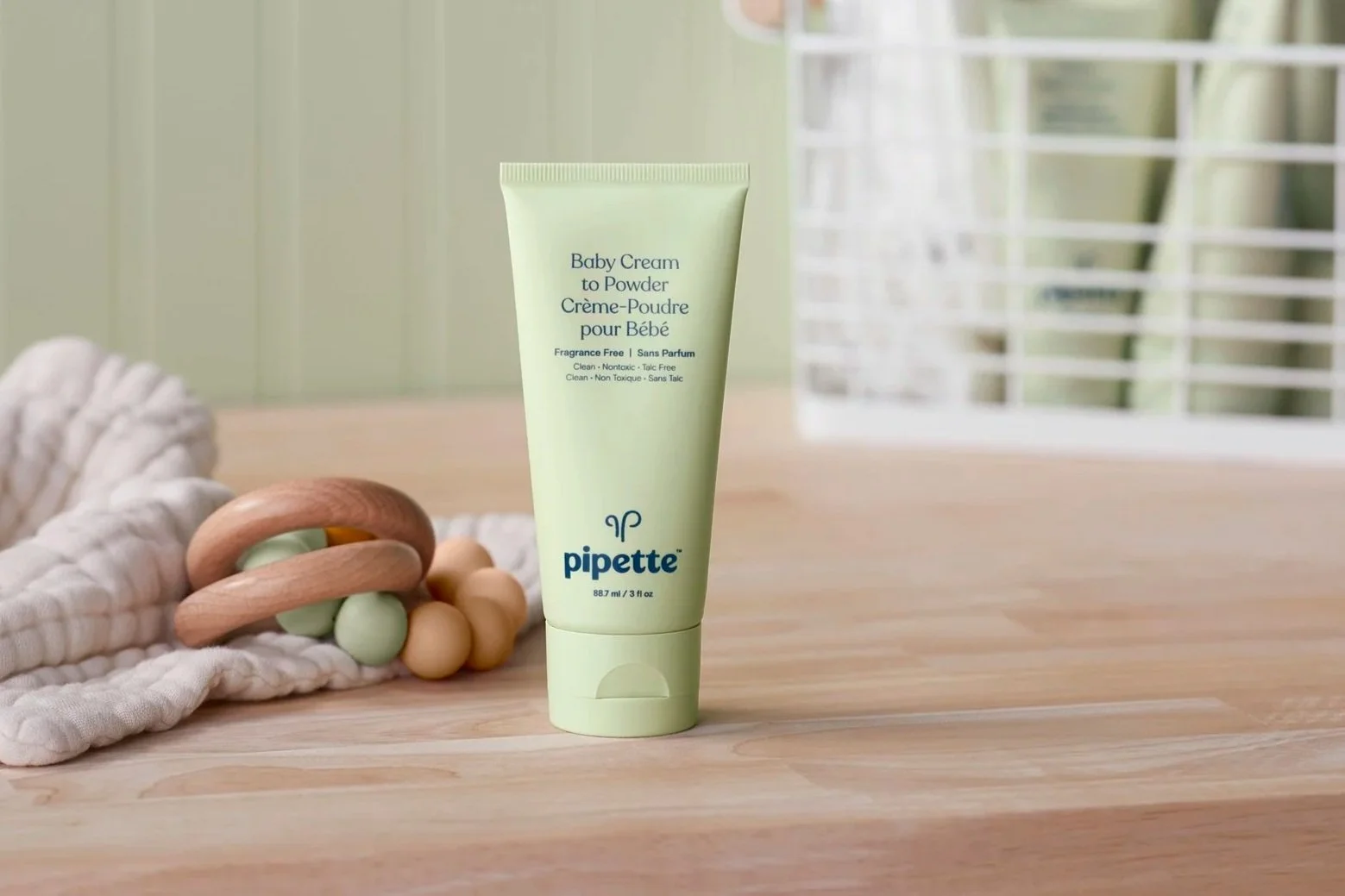
CAMPAIGN

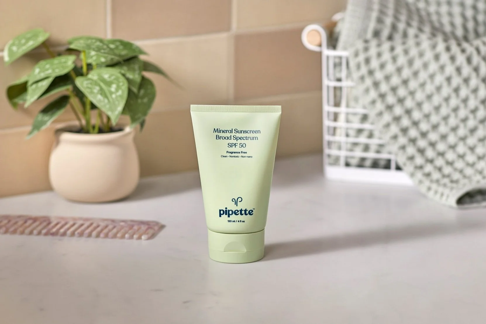
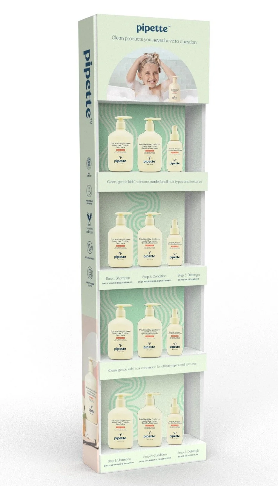
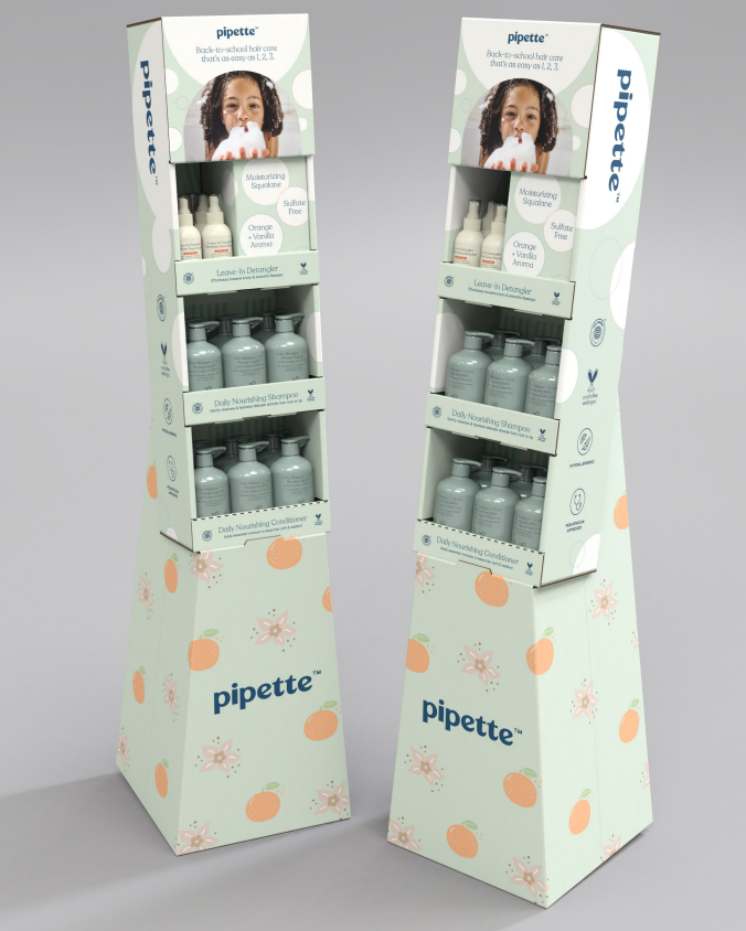
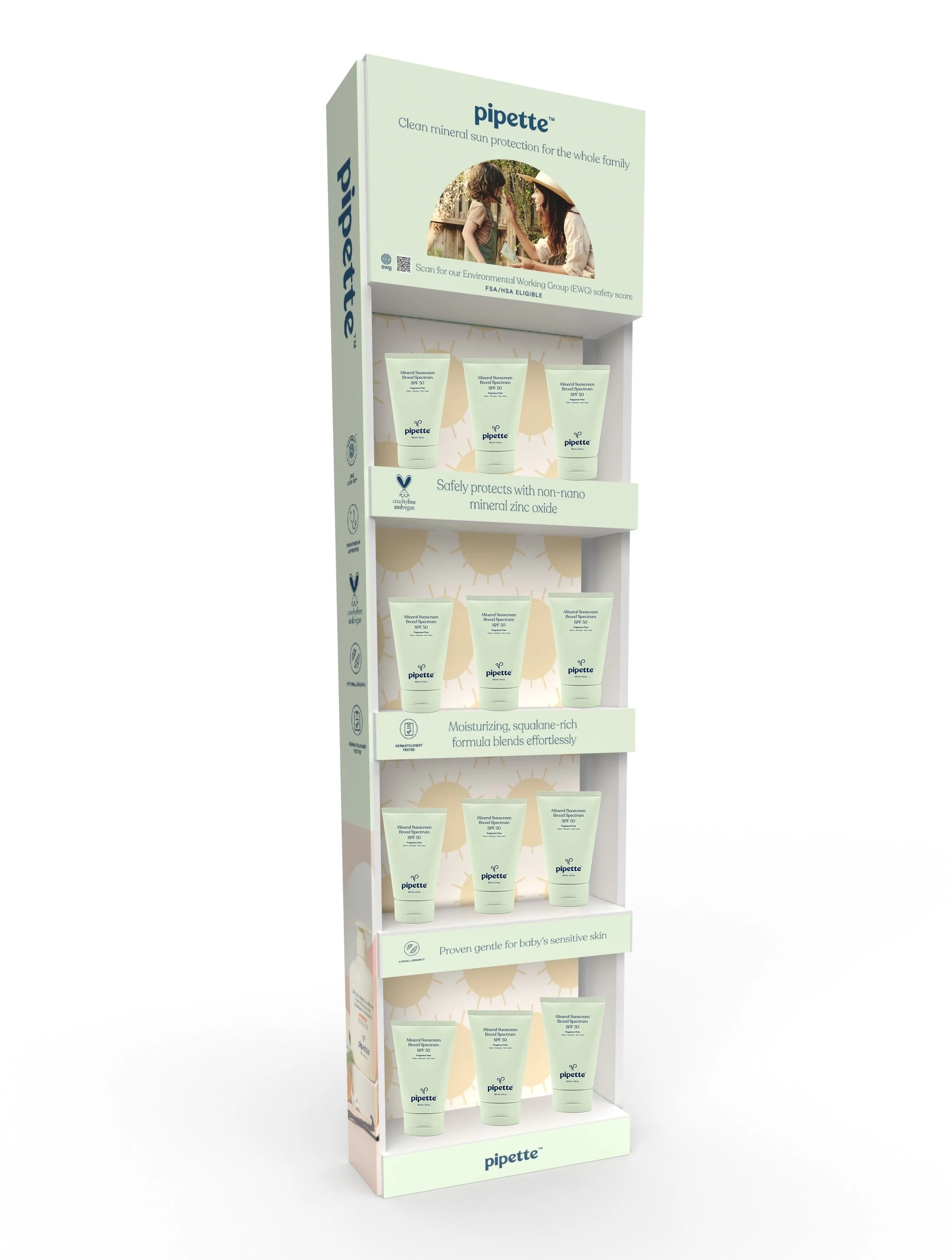
New look applied across assets, creating fresh, modern brand instead of playful and fun. Marketing channels, website redesign and floor displays direction all given a facelift.
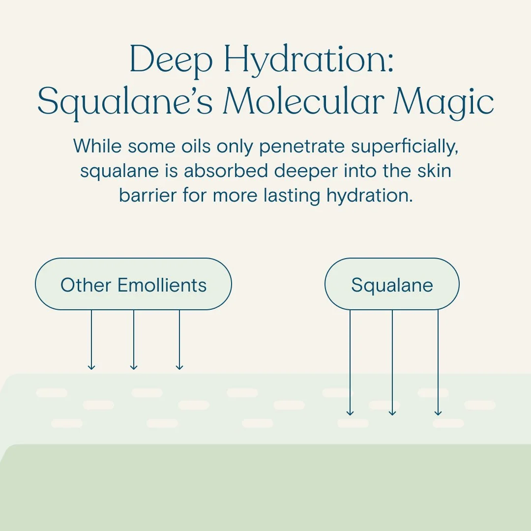
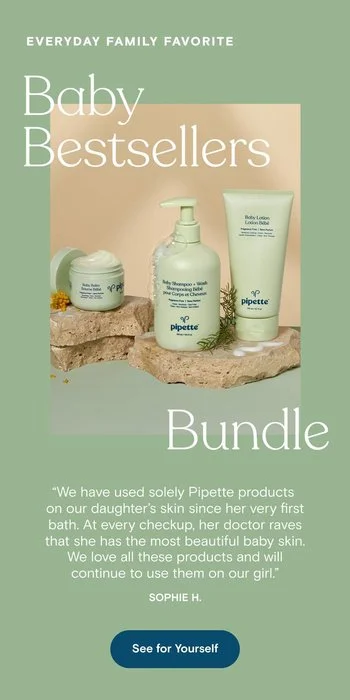
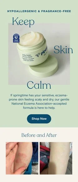
Evergreen
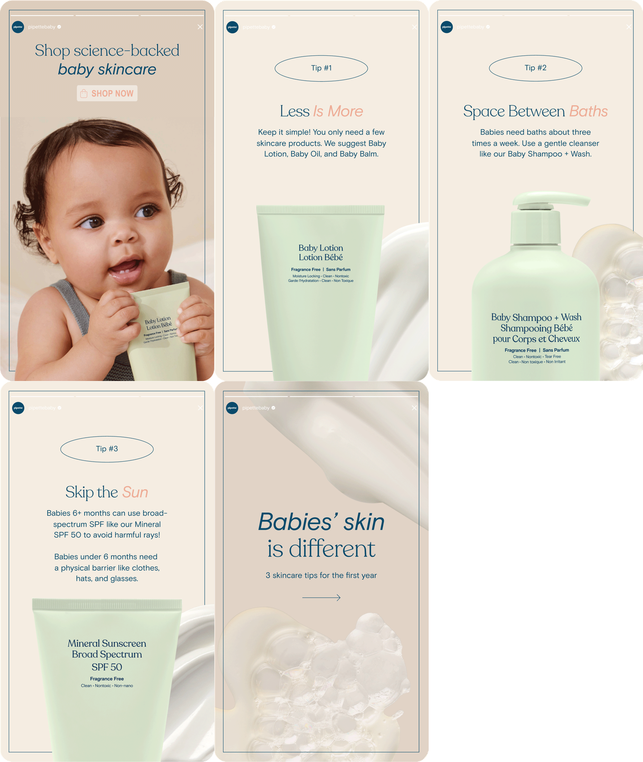
Clean baby brand, Pipette, is both minimal in ingredients, and minimal in design. Goal was to appeal to our clean, but not fussy customer, with recognizable visuals and crisp graphics and typography. To achieve this, we redesigned the look and feel of our digital assets, including ads, social media, email and website, giving the brand more cohesion.

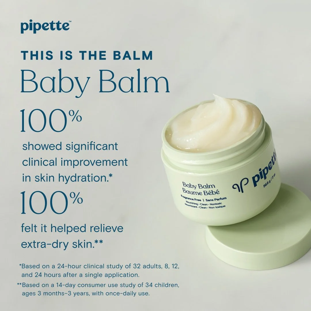
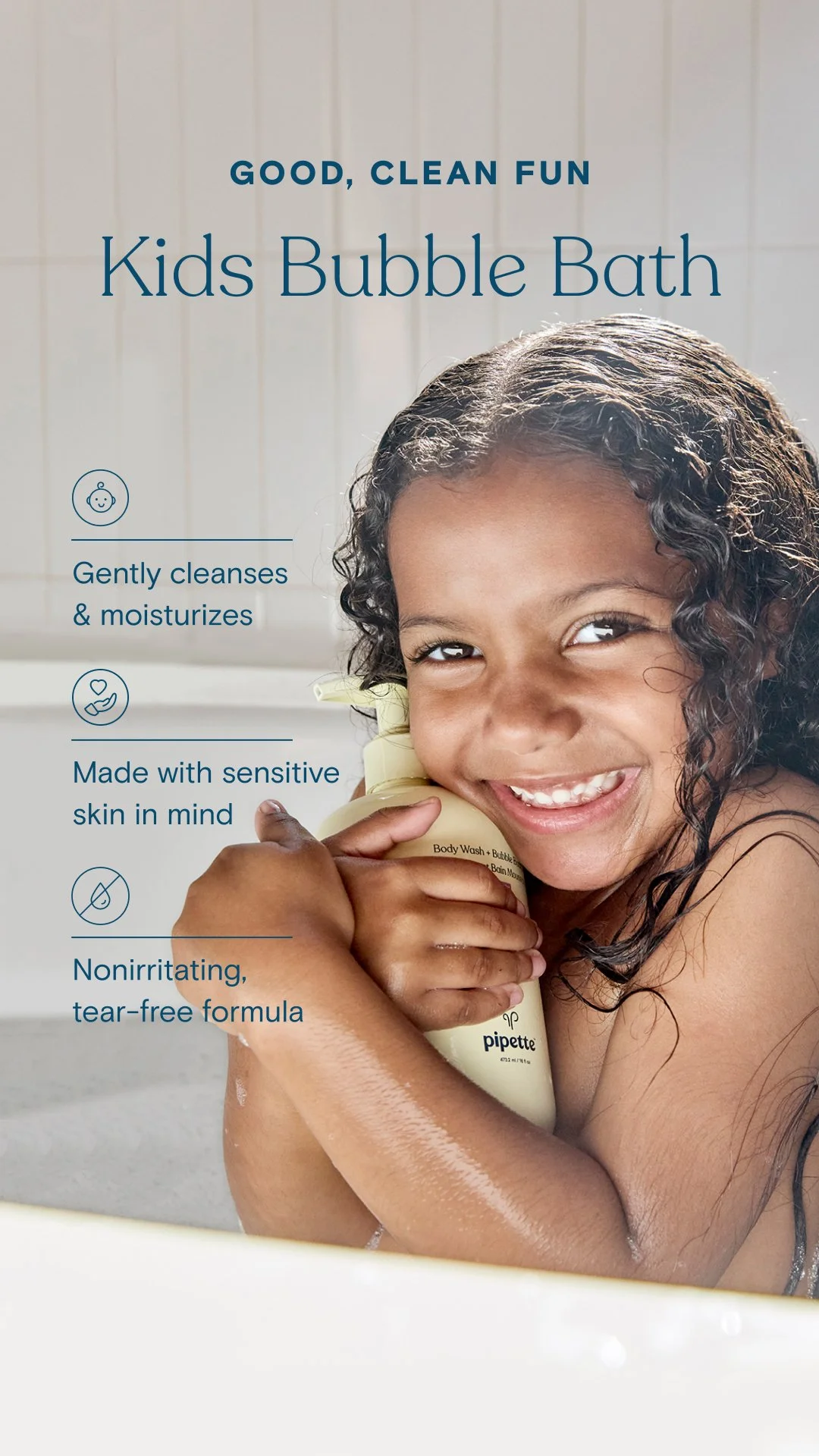

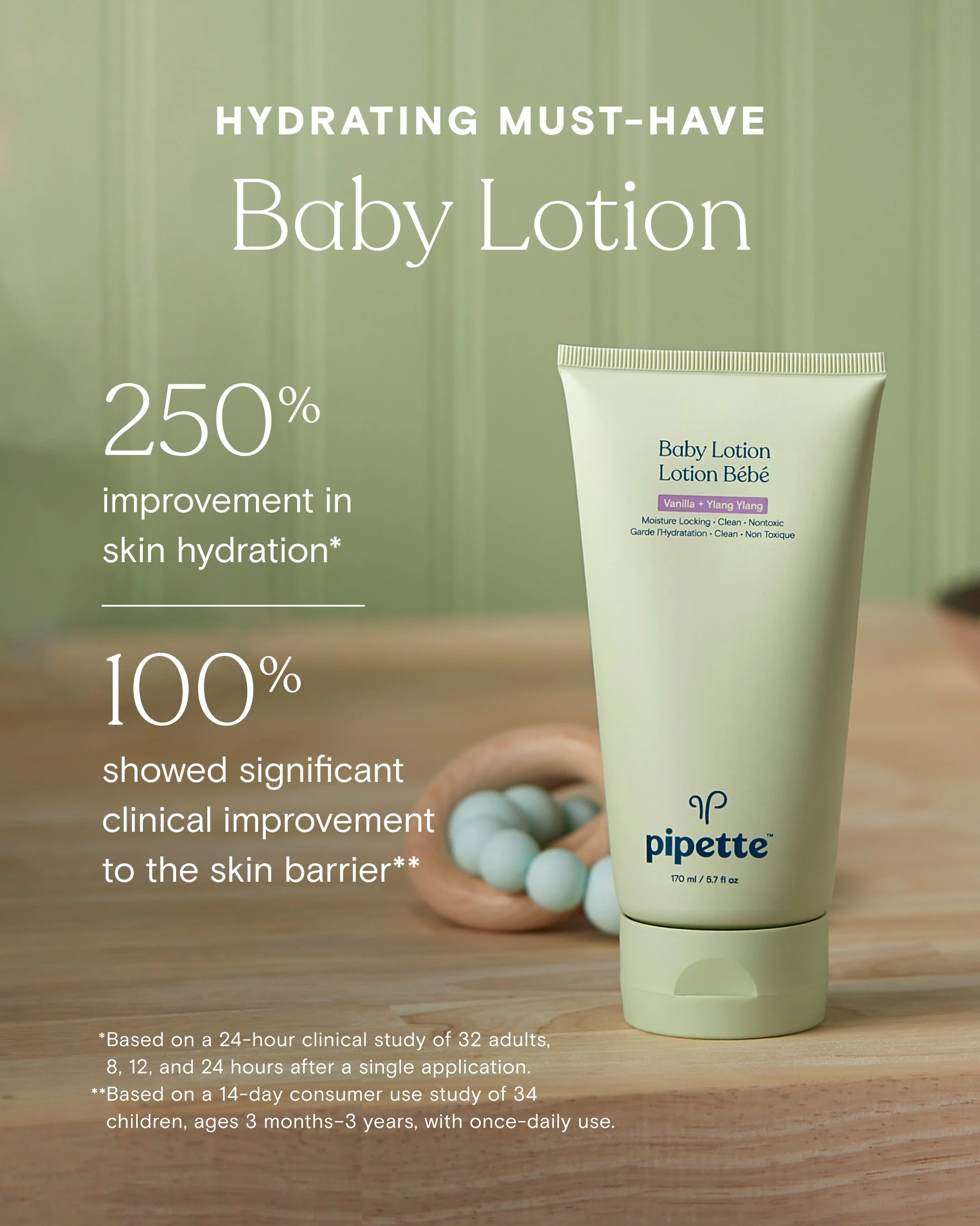


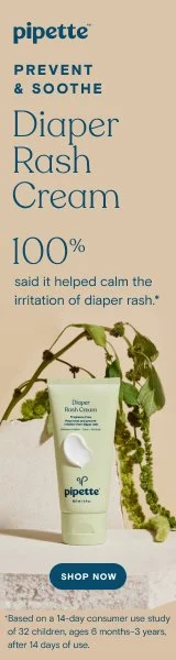
Eczema Campaign
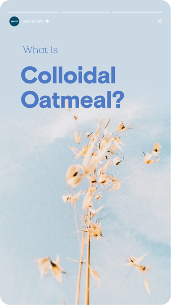
One of top sellers for the brand, an early fall Eczema Campaign was part of their annual marketing calendar. Led this campaign by creating toolkit: including typography, color and graphic direction for the 2023 year. As always, crisp and clean with modern and playful direction.
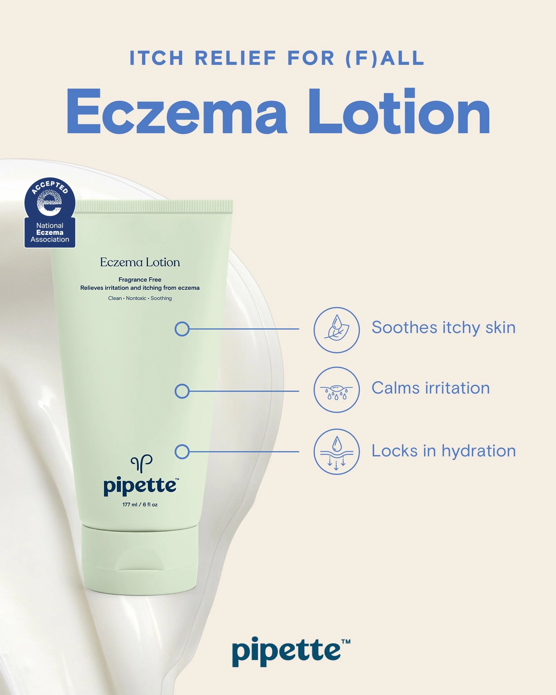
Social Media Assets
Continuing the campaign across platforms, we created a playful pastel graphic and as a background through line, keeping the subject a little lightheared .
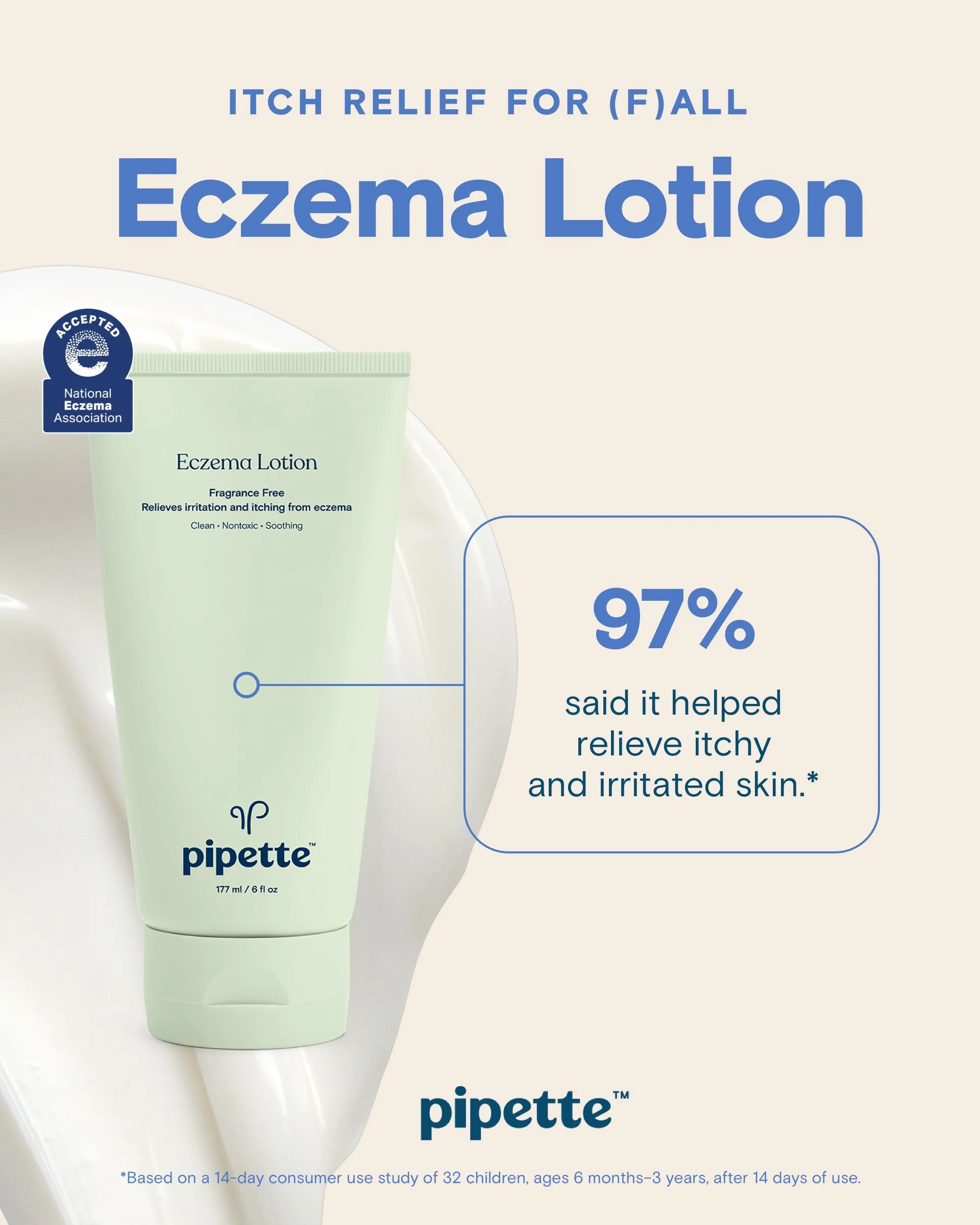
Discovery Ad A/B TEST
Using same graphics and headline, just changing the claim to test for clickability and impact.

Holiday Campaign
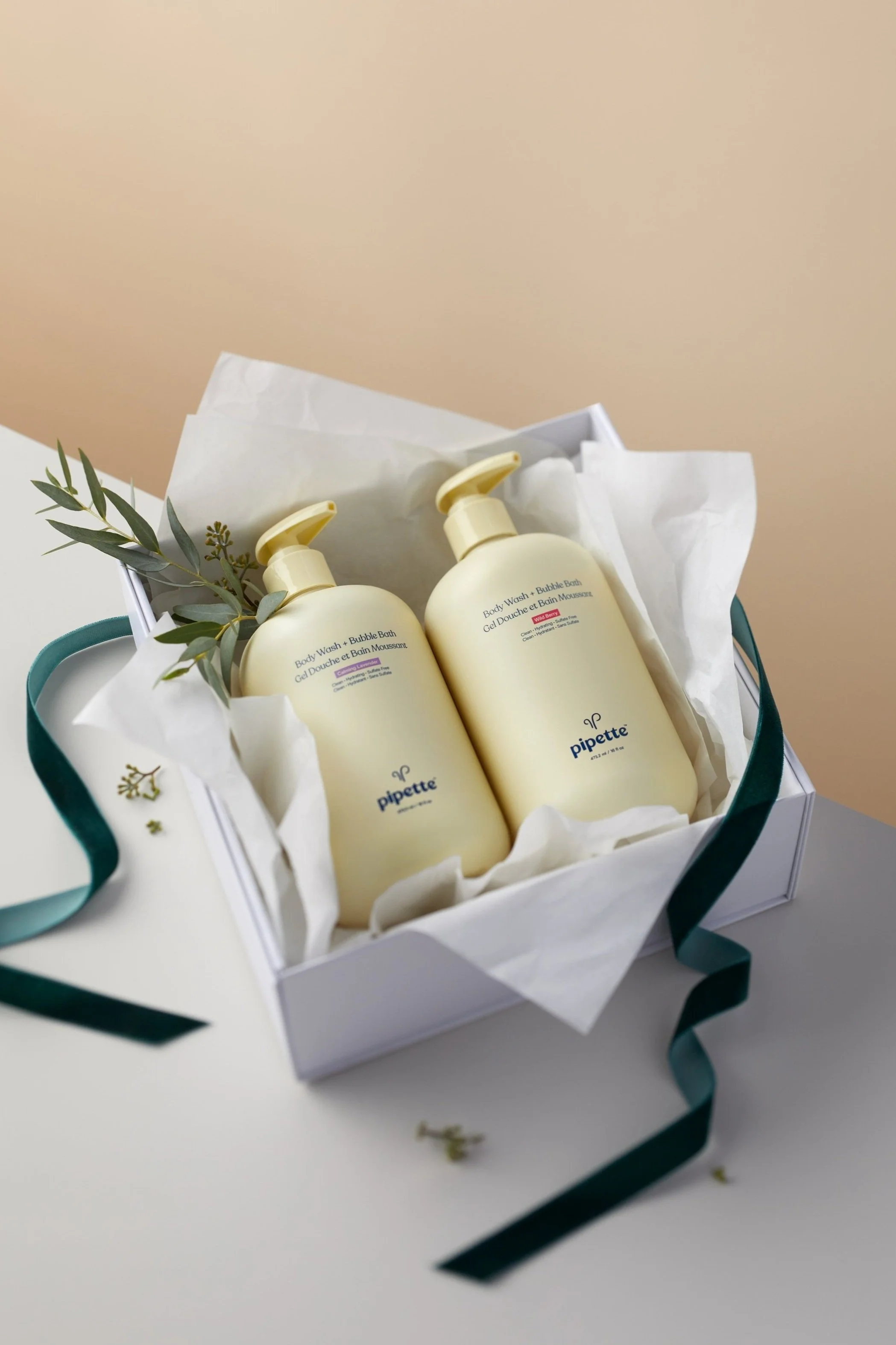
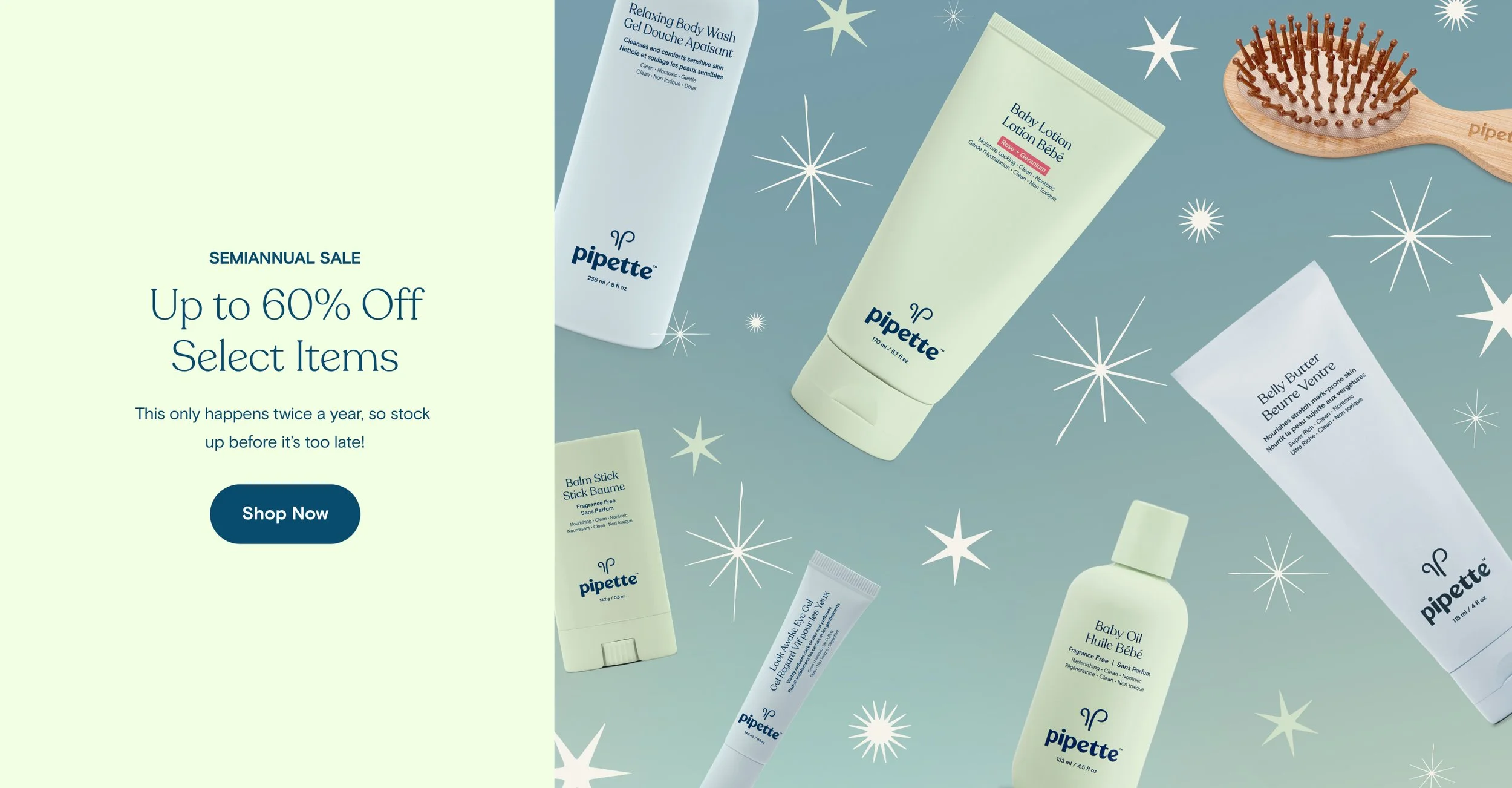
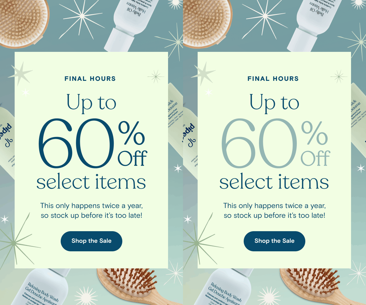
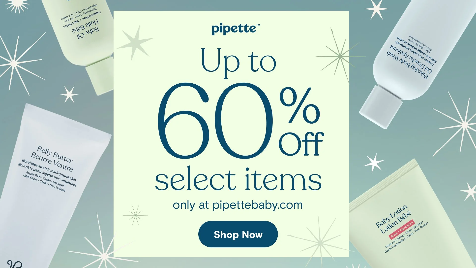
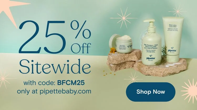
A small holiday budget called for a few key studio gifting shots and some graphics that would keep the magic of the holiday season alive. Incorporating prisms, gradients and stars was our way of channeling holiday whimsy and delight.


Mother’s Day Campaign
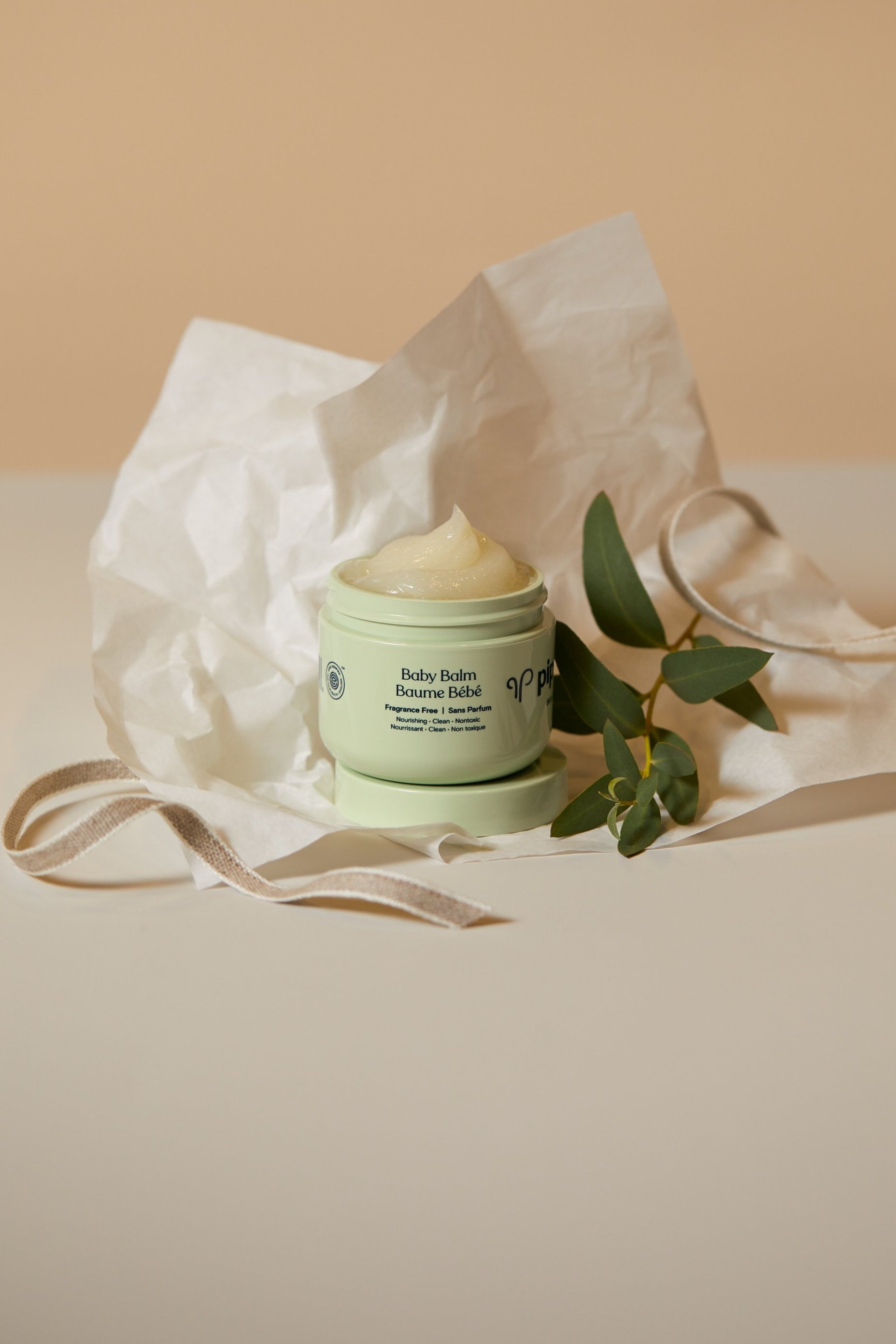
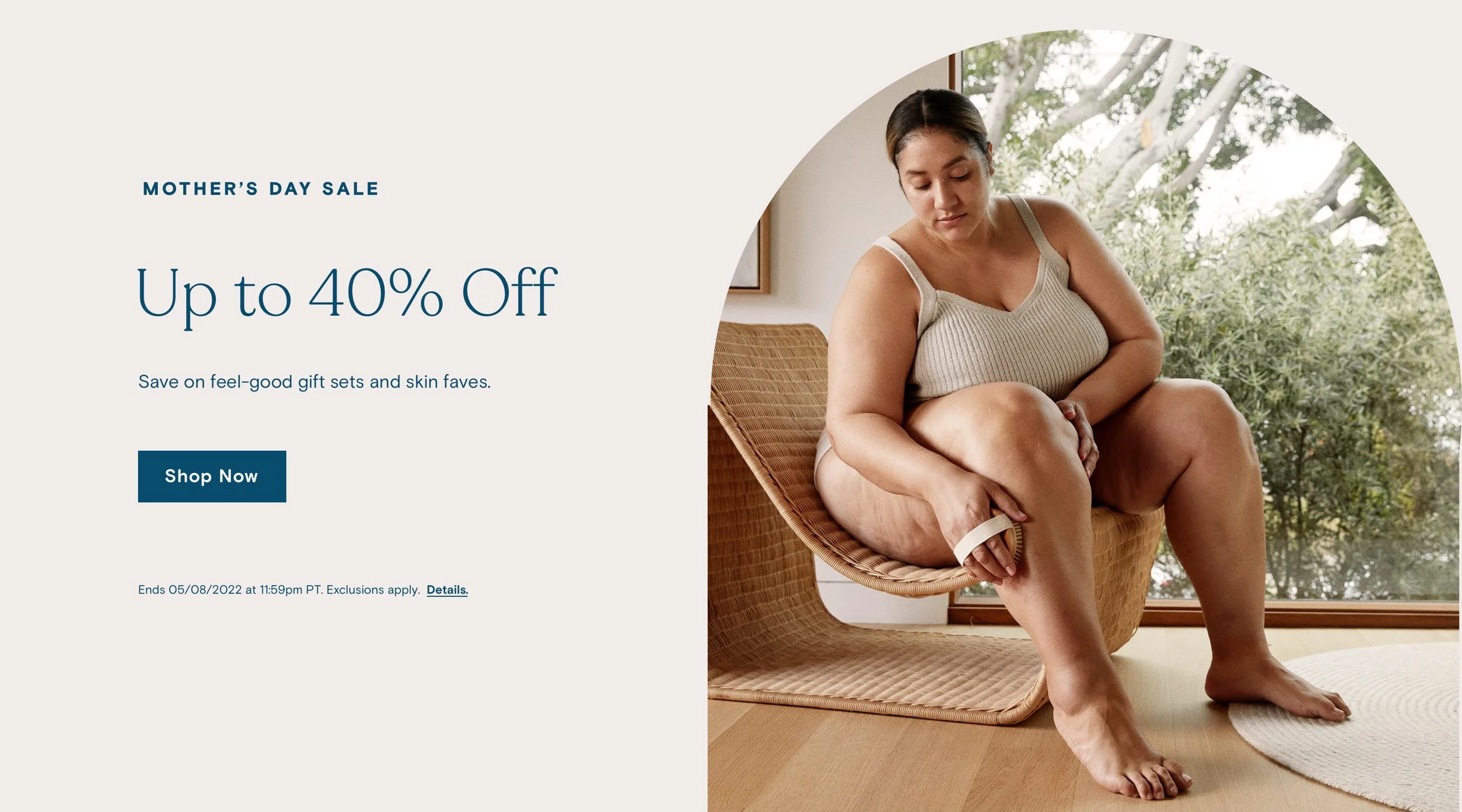
Mother’s Day was one of the most celebrated holidays at Pipette the objective was always to make mothers feel as unique and whole as they are. Direction was aspirational and approachable with an emphasis on inclusivity. Styling and props were neutral and non distracting, with cozy knits and color palette evocative to surrounding environment and b


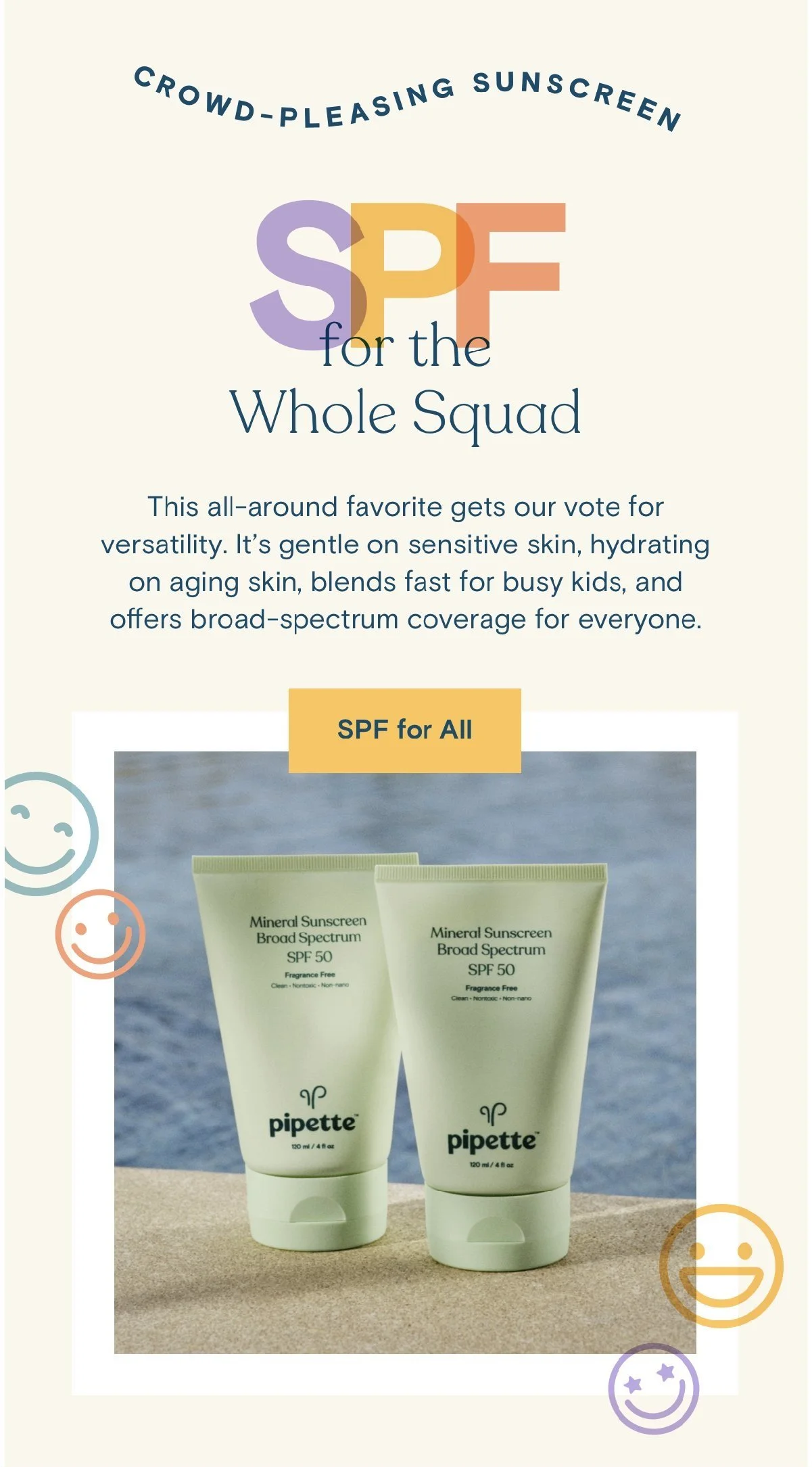
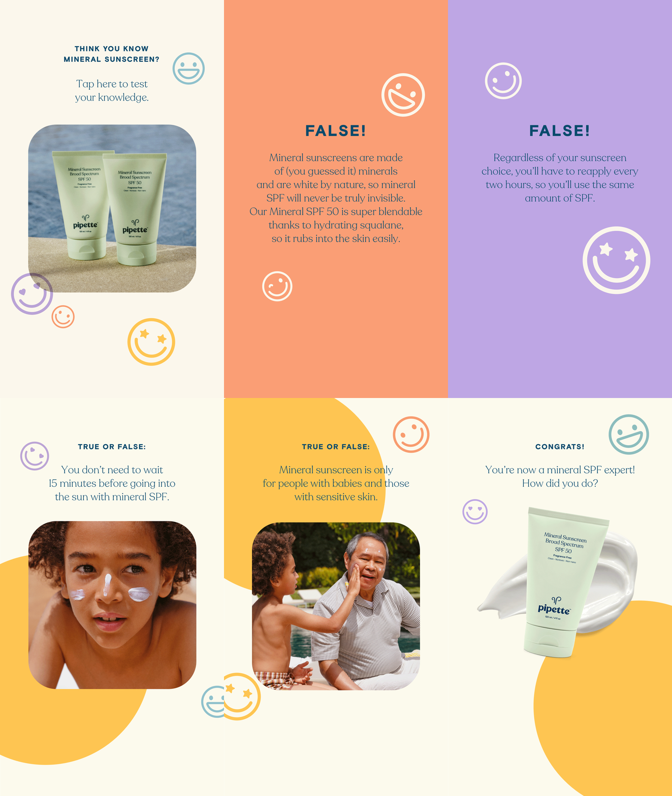
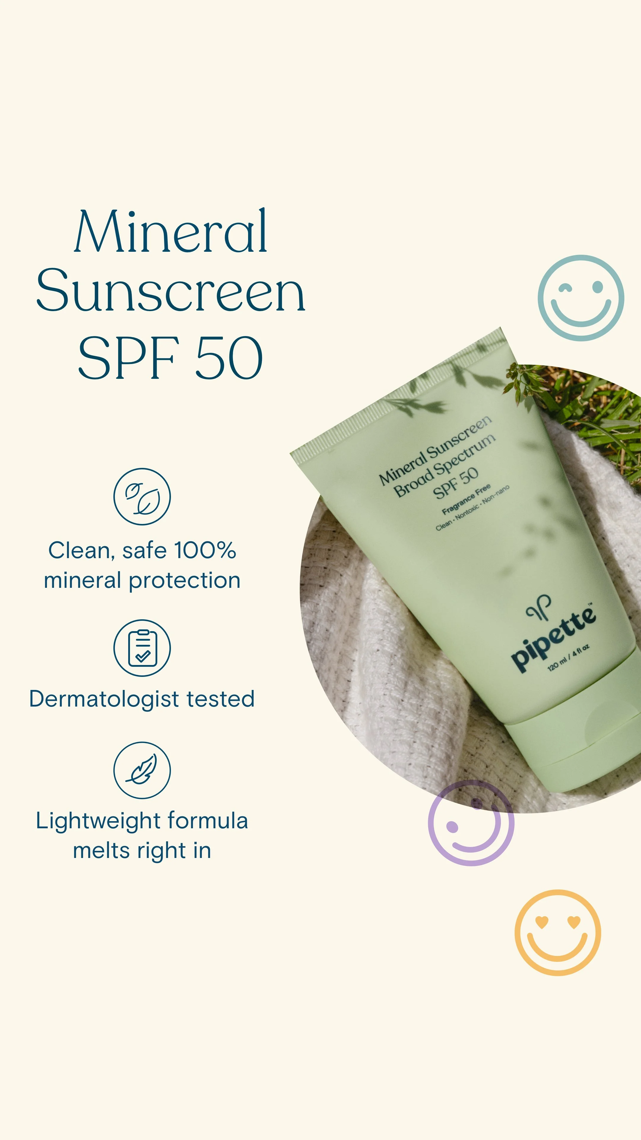
SPF is Pipette’s #1 seller, and to create excitement for new stick and spray, we started a summer sun campaign to get people excited about new products on the horizon and start to create summer graphics that would be synonymous with the category. Shot at in house studio.
Sun Campaign
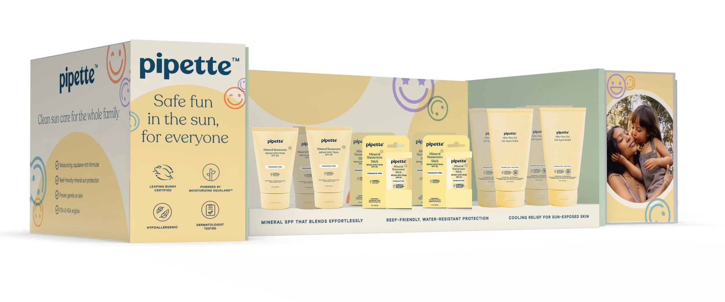
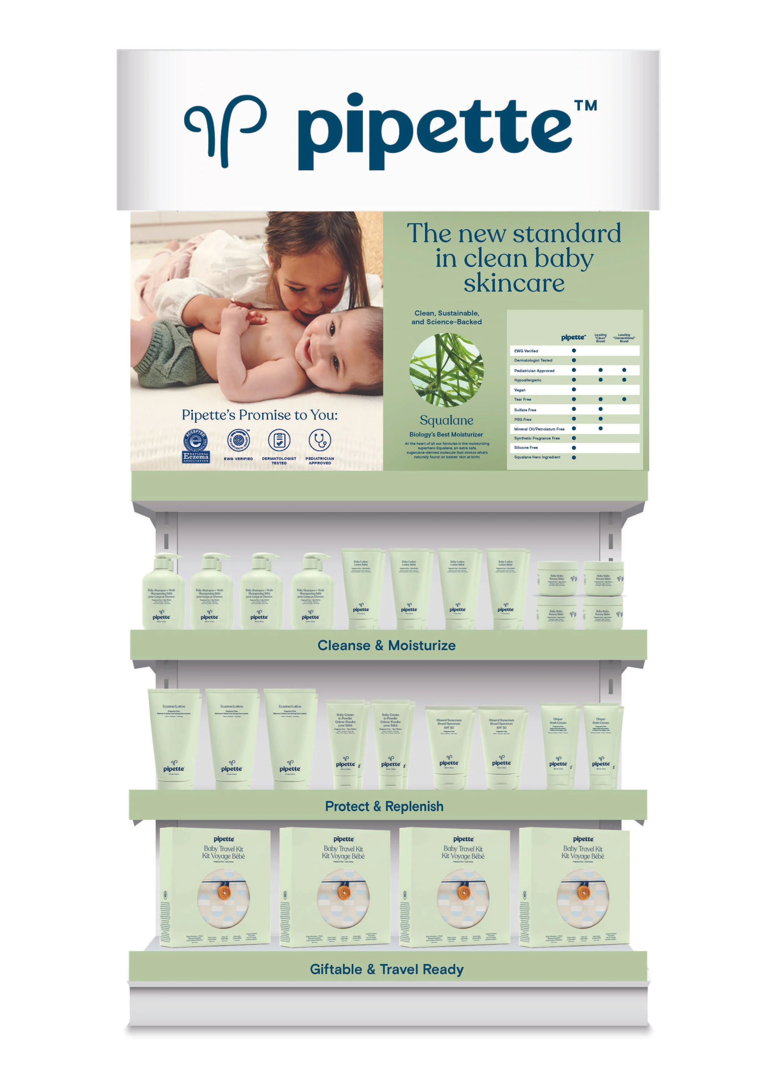
Retail Display